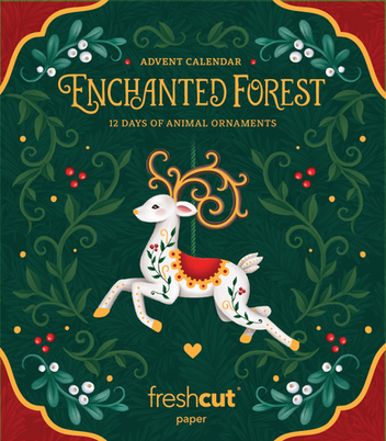
Enchanted Forest
Packaging Design || Instructional Design
In my role as Print & Packaging Designer at FreshCut Paper, I was responsible for driving the development of new and innovative packaging experiences. This included leading design exploration, testing fresh creative approaches & shaping the evolution of the company’s aesthetic to expand how the brand engaged customers both visually and experientially.


I led the development & design of this enchanting advent calendar box set, collaborating closely with one of FreshCut Paper’s illustrators to bring the concept to life. Guided by the creative director’s vision, the goal was to elevate beyond the brand’s previous packaging style and create something timeless, elegant, and magical. An object so beautifully designed that people would want to purchase it for the box alone.
The Process
The Enchanted Forest Advent Calendar showcases twelve 3D paper animal ornaments, each displayed in its own festive card. The ornaments are delicately crafted with gold-foiled details and elegant beads, making them both artful and collectible. I designed the packaging to reflect the product’s aesthetic, evoking a whimsical, storybook charm inspired by Scandinavian Folk Art.


Moodboard:
Design Keywords:
-
Classic
-
Timeless
-
Enchanting
-
Charming
I began the process by developing a creative direction with moodboards and sketches, guided by the design keywords provided by the creative director.
Hand-Drawn Title Type
I designed a custom hand-drawn display typeface for the product title, echoing the hand-drawn lettering style featured on the product cards (example on the right). Both were developed using the typeface New York as a foundation. I designed both a landscape and stacked version of the product title.


Once the title type was approved, I did an initial round of designs for the creative directer to review. These initial drafts aimed to answer two key questions he had:


1. Red border, or no red border?
The creative director was struggling to decide whether he liked the look of the box with some form of red border or not, worried that the red wouldn't feel sophisticated enough. I chose to advocate for the inclusion a red border for several key reasons:
-
Created a more festive feel.
-
Increased visual impact with stronger contrast.
-
Framed the design as a “window” into the product’s story.
-
More accurately reflected the product, with cards in both red and green.
-
Complemented and highlighted the red accents in the berries and saddle.


2. One reindeer, or two reindeer?
Both orientations had strong merits: the symmetrical version was visually pleasing, balanced, and aligned with the Scandinavian aesthetic, while also allowing more space for typography. However, I felt this version risked misrepresenting the product by suggesting multiple of the same ornament, or that there might be 12 identical ornaments within. The single reindeer more accurately reflected the contents, emphasized the artisan quality, and used subtle asymmetry to draw focus to the product and reinforce the hand-crafted, story-driven feel of the brand. After getting consumer feedback, a single featured reindeer was the clear final direction.
The Packaging Resolution
After addressing and resolving the project’s key pain points with the creative director, I transitioned into final execution. I photographed and retouched the images for the back of the box, prototyped, and executed the final production files to ensure print accuracy, bringing the entire package seamlessly from concept to completion.
The Opening Instructions

To streamline the user experience, I grouped the 12 ornaments into three core unfolding methods. I then created clear, illustrated instructions using representative animal examples from the product for each method, ensuring both clarity and consistency.

I crafted the technical illustrations, layout, and wording to deliver clear, intuitive instructions while preserving the product’s hand-drawn, artisanal character.
The Final Marketing Imagery


